

Tamil Thadam
Typography / Composition / Traditional Printing

Tamil Thadam
Imprints of Tamil
This project aims to bring a new perspective to classical Tamil texts from the Sangam era by crafting visually engaging, contemporary designs using lino printing inspired by Tamil script. By blending traditional Tamil typography with contemporary designs, the project intends to make these ancient texts, each rich with timeless wisdom, accessible and appealing to a modern audience. The texts selected, including Tirukural, Tholkappiyam, and Seevaga Chinthamani, are pivotal works that reveal the depth of Tamil language and literature, parallel to the development of Sanskrit.
Ideations

Process

Lino Prints
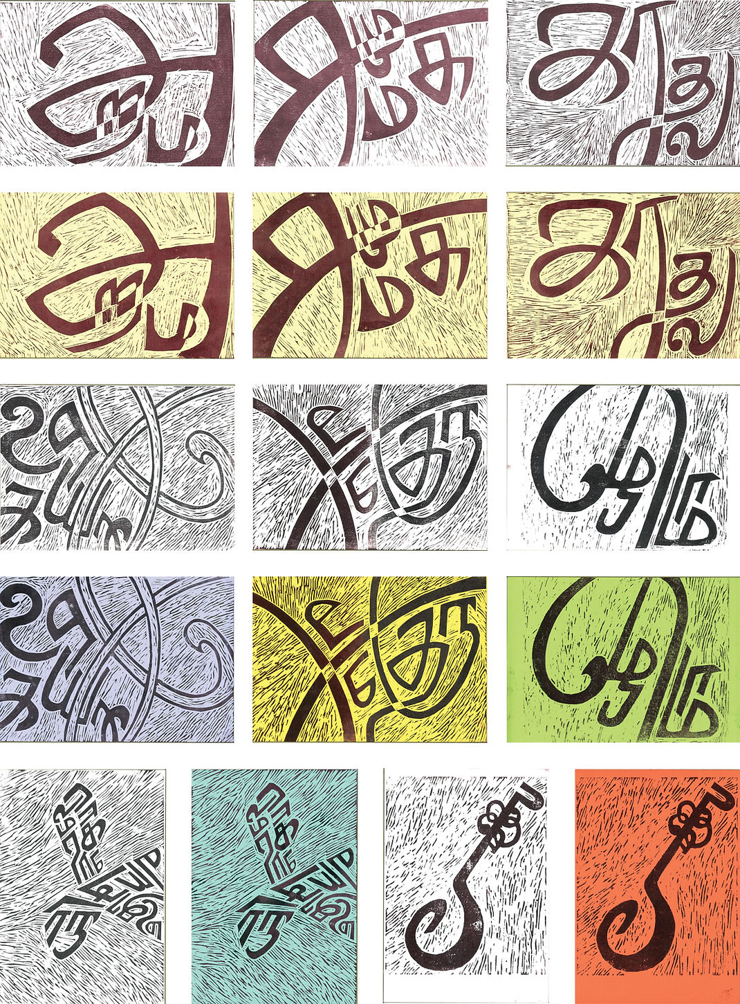
Colour Palette

Book Covers


Thirukural is divided into three parts, book of virtue, society and love.
The first book is called 'Aram: அறம்' which means 'Virtue' and is associated
with the colour blue. Second book is called ‘Porul’ talks about Society (Samugam: சமூகம்) and can be associated with growth, thus the use of colour green. Third book is called 'Inbam' which talks about 'Love (Kadhal: காதல்)' thus the colour pink.
Tholkappiyam is a book that talks about Language and Literature
(Ilakiyam: இலக்கியம்) The colour used is light brown, to indicate the teachings passed on from old times.
Seevaga Chinthamani is a book themed on marriages(Thirumanam: திருமணம்). The colours red-brown, maroon and yellow are all associated with marriage. The use of two colours indicated the alliance of two souls


Posters


Post Cards


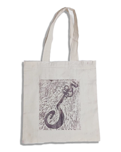
Lifestyle Clothing and Accessories
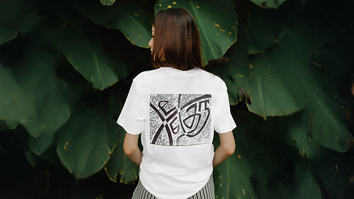

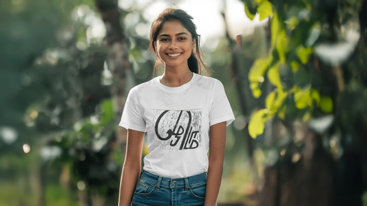
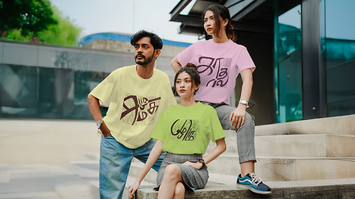


Hand Printed
 |  |  |
|---|---|---|
 |  |  |
There's more to see!
Other Projects


DORI - BRANDING

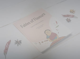
FABLES OF FLAVOURS-PUBLICATION


FOREST ESSENTIALS - PACKAGING